Sunday, May 3, 2009

Last one!

As I was perusing through my blogs from throughout the semester, I realized I learned A LOT about the various topics covered in class. I mean, I really loved reading about Buckminster Fuller, especially his Dymaxion maps, and biophilia, and transgenic art. I think overall, I have a heightened awareness of any and all aspects of nature found in art. For example, when I was at the opening for MoCP's new show The Edge of Intent last Friday, I noticed I was completely surrounded by photographs depicting some aspect of human interaction with nature. It makes me wonder, is there any type of photography that doesn't involve nature in some regard?

My 'ah-ha' moment came while reading The Death of Environmentalism where the authors break down the three environmental movements and explain why political legislation is outmoded and doesn't work anymore. If environmentalism is treated as nothing more than legislative proposals, then it's seen as just another special interest or a "thing" separate from humans. The most logical answer to current environmental problems is to have an inspiring vision that a majority of Americans can get excited about. That investment and alliance building with industry and labor is the key to a global environmental movement.

I also really enjoyed the practice of blogging over that of journaling. The loose structure made for a really dynamic range of blog entries and I got a lot out of reading everyone else's blogs and what they took from the readings. I must admit this was my first blogging experience and it's an amazing forum to reach out to the community and promote ideas. I now see our blogs come up during google searches, which is a little nerve-wracking and fun at the same time.

I must say, however, that I wish the class could have read something more extensively about human nature, and not just human/nature. Human nature was touched upon in Gary Snyder's article, in the biophilia article, and indirectly in many of the class discussions, but never given very much attention as a topic all on its own. It always applied to something just out of reach of my own work, like the idea of a "natural human" as someone who lives more in sync with nature than other humans. I could apply the idea of a "natural human" to my transgender photos, but not nearly in the same context it was used in the article. I'm not saying I'm upset about this; I signed up for the class because landscape and nature is an area I wanted to learn more about, and I did. But because many of the assignments called for us to use the readings to reflect upon our own work, I often found myself at a loss to do so, at least without stretching the ideas to great lengths or calling upon my own research.

I now leave you with a rather embarrassing YouTube video my sister made of our cat Vincent playing fetch. Sure it's cute, but in terms of a cat's nature, and for the purpose of this blog, is it natural?!? Well, it is for him!


Monday, April 27, 2009

After Nature- just another "post"

In the exhibition After Nature at the New Museum in NY, the artworks represent a landscape of the future inspired by dystopian literature and sci fi culture. It gives a bleak vision of the future, depicting the fears and desires of the the 26 artists whose work contributed to the show. When viewing much of the work I was reminded of Alan Weisman's book The World Without Us, which is a scientific examination on how the world would look if humans were to disappear instantaneously. I first learned about this book from Weisman's appearance on the Daily Show back in 2007, and it seems the commercial success of this book triggered a post-nature, futuristic trend in art, literature and culture. For example, I now see all sorts of hour-long programs on the History Channel, which I just found out is a series called "Life After People," addressing the idea of what would happen to the world if people were to suddenly disappear.
I love the tagline on this DVD

The 2012 doomsday event, which was predicted by the ancient Mayans, is fast approaching and probably fresh on every one's mind, not to mention also being capitalized on by Hollywood in the upcoming film 2012. Whether it be the Mayans' 2012 theory, Nostradamus, or the Book of Revelation, humans have been fascinated with our own demise for millenna, and still are today. But even though I actually really enjoy the prospect of an imminent doom for all humanity, it seems like bad karma that people are putting so much thought to our own demise, as though we are not only anticipating human extinction to come soon, but that the more we talk about it, write books about it, make movies about it, the more of a likelihood it will become. It is as though we feel we deserve it, for whatever reason, and will thus welcome it with open arms.

When looking at the artworks in After Nature I noticed one of the audio clips mentioned Robert Kusmirowski's full scale replication of the Unabomber's cabin, but I didn't see a visual of it on the website. So I looked it up, and sure enough, there was a full scale model of the Unabomber's cabin in the show. It seemed severely out of place with the rest of the art, although I can't say this with total certainty because I wasn't actually there to see it, but in the audio clip the show's director describes it as representing trauma; that Ted Kaczynski represents a "crucial traumatic persona in the recent history of America."
Robert Kusmirowski, Unacabine, 2008

Still, this doesn't seem to comply with the initial statement of the show as depicting "a universe in which humankind is being eclipsed and new ecological systems struggle to find a precarious balance." I wonder if it was meant to fit with the other works not in a literal way, but to add to the feeling of dread or hopelessness. No one likes a misunderstood-genius-serial killer and perhaps that was the sole basis for having this piece in the show. I listened to the audio selection of the Unabomber Manifesto, and I don't know how this was incorporated into the show or if this was strictly meant for the website.

I imagine the show was relatively ominous and bizarre compared to most other art shows, and this leads me to question if we are actually interested in the concept of "post-nature" or scared of it. Do people find the idea of a future dystopian world interesting or terrifying? I suppose both, and that is why it has been given so much hype lately, because it is both a fear and a fascination.

What is post-nature, anyway? Is it the idea of nature devouring humans or humans devouring nature? Who gets booted off the planet? This entire concept of a "post-nature" perpetuates the commonly held notion that people are separate from nature, insinuating that a war between humans and nature will determine the fate of our future. But no matter which side wins the battle, according to the After Nature show, the outcome will be bleak and dreadful. I think this whole concept is bogus. I think the term post-nature or post-black or any of the current "posts" that are being coined and circulated are nothing more than trendy and meaningless labels. Don't get me wrong, I like the idea of examining the future relationship between humans and nature, but to label it post-nature or after-nature seems dangerously anthropocentric to me.


Monday, April 20, 2009

Time and Space

Upon reading Alan Singer's "Comprehending appearances: Werner Herzog's ironic sublime" I found myself really wanting to watch all of the films listed in the essay. I went online and found a really low resolution version of Fata Morgana and attempted to watch it, although I think I'll have to rent it to get the full effect. It seems pertinent to the essay that you have some sort of understanding of the films, since Singer doesn't give much of a plot synopsis of the films and leaves you in the dark much of the time, assuming you already have pretty clear mental visuals of what he's referring to. I wanted to explore the idea of a Fata Morgana, or mirage, because it reminds me of a mirage I saw in Etosha Pan, Namibia (during a j-term course in 2005). I don't have a personal photo of what the mirage looked like, but here's a pretty good example of what I saw.
Mirage from the distorting heat of the salt pan

In the beginning of Fata Morgana, Werner Herzog shows several airplanes landing over and over again on a single runway. When each plane lands, the camera cuts to the next plane landing in the exact same manner. The more airplanes that land, the more smoggy and polluted the air becomes. Eventually there is so much exhaust in the air, the airplanes look wavy and distorted and appear to change direction, almost as though they going to run into the camera. In the essay, Singer states that this scene "graphically belie the eschatology of the creation myth that would return us full circle to a timeless beginning. Ironically, the tedium of abortive montage is our most scrupulous awareness of the ineluctable passage of historical time."

I don't quite know exactly what this statement means, but I think Singer is trying to comment on the repetitiveness of this scene and how it creates a unique idea of time instead of showing the airplanes in "real time." Time appears to be a theme in Singer's essay and he uses in many contexts without fully explaining what they mean; for example, he throws around phrases such as human time, narrative time, and historical time. How can time be different in these regards? Is narrative time simply the sequence of events in the film? Does human time refer to the experiences of the actors or the audience, or neither?

While Singer experiments with notions of time, William L. Fox's Terra Antarctica: Looking into the Emptiest Continent experiments with notion of space. Fox is interested in "how we use cultural means to augment our neurobiology in order to overcome the perceptual difficulties we experience when exploring large spaces." I especially liked the parts of the chapter where he discusses the connection between cartography and art and how they share a common and ancient visual framework.

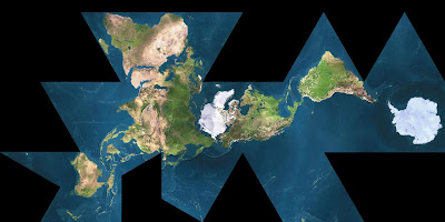
This reminded me of Buckminster Fuller's Dymaxion maps, where Antarctica is given full respect for being a continent instead of being chopped up at the bottom like it is in any traditional map. The grid that makes up the lines of latitude and longitude become messy when flattened into a two dimensional rectangle, causing a common map to misrepresent the big circular continent. When I was a child I never even knew Antarctica was circular, it always looked like a long white blob at the bottom of the map.

World map

Buckminster Fuller's Dymaxion map

Photographer Anne Noble has studied the varying maps of Antarctica that exist in our world and in her maps series, she depicts some of these common representations of antarctic maps. Of these maps she states, "This collection of maps points to the way visual colonization of place occurs as a part of the way that we map, photograph, organize, define and interpret place." Noble shows her viewers the ways in which culture has come to know and interact with Antarctica through mapping.Anne Noble, Bung in Antarctica on a blow-up globe, 2005

Anne Noble, Scott Polar Research Institute, 2003

Anne Noble, Board game produced by Shell Oil to commemorate the Hilary/Fuchs Antarctic expedition of 1957-58, 2006

Anne Noble, Biscuit, 2006/2007

Besides the connections between art and cartography, Fox also mentions the visionary dissonance that occurs during whiteout conditions in the antarctic. Visible light is dispersed in a perfectly even manner and your balance and coordination is lost. Fox even mentions that many people experiencing temporary visual impairment involving hallucinations and loss of vision. Noble reflects on this disorienting feeling in her White Out series, which depicts potentially terrifying moments of a blizzard when visibility is limited to tones, textures, and layers of whiteness. Distinction between ground and sky is mostly, if not completely, eliminated.Anne Noble, White Out, 2002-2007

Anne Noble, White Out, 2002-2007

Noble's all-white landscapes remind me of photographer Hiroshi Sugimoto's Seascapes, where sea and sky become monochromatic shades of grey.

Hiroshi Sugimoto, Aegean Sea, Pilion, 1990

Monday, April 13, 2009

The civilized landscape: experience it or bust

I will wholeheartedly admit, it has taken me a really long time to understand and appreciate the complexities of landscape photography.  As an artist, I have always been attracted to images of people; to me landscapes have always seemed less intricate than the face of a human being.  Most of this has to do with the fact that I literally cannot photograph anything with a horizon line, it just doesn't come naturally to me.  But upon arriving at Columbia and being surrounded by many contemporary landscape photographers as well as reading numerous essays and articles about the topic, I feel like I finally have a clue.  

The topic for this week's readings is "New Topographics" which was the name of an exhibition at the International Museum of Photography at the George Eastman House in 1975.  This show included works from landscape photographers such as Robert Adams, Frank Gohlke, and many others.  The "New Topographics" exhibit indefinitely changed the way landscape photography would be viewed and practiced throughout the U.S., because it forced people to acknowledge the fact that the geography of the land is no longer considered "unspoiled."  That humans have become an intricate and integral component to the landscape.

For the New Topographics artists, the experience of being in the landscape is crucial not only to the picture making process, but also to the quality of image that comes out of their subjective experience.  A chapter written by Robert Adams entitled "Truth and Landscape" attempts to analyze some of Adams' thoughts he has encountered in regards to photographing landscapes.  At one point Adams points out the importance of the photographer's presence, that is, the photographer's point of view, to landscape art.  He states, "Making photographs has to be, then, a personal matter; when it is not, the results are not persuasive.  Only the artist's presence in the work can convince us that its affirmation resulted from and has been tested by human experience.  Without the photographer in the photograph the view is no more compelling than the product of some anonymous record camera..."  For Adams, beauty and aesthetics are not the only factors involved in making a convincing image.  The quality of image directly correlates with the subjective element to landscape art.   That for a photographer to divorce oneself from the experience of the landscape is undesirable and devalues the ultimate meaning of the art.

This same issue of subjectivity affected Frank Gohlke's opinions of artmaking.  He wrote, "As different as the places depicted in these photographs are from one another, they have at least one thing in common: being there made my pulse speed up, and the making of a picture seemed the only appropriate response."  For Gohlke, the infusion of place and photography is a seemingly personal and impulsive reaction to the landscape, and this relationship is thus
 documented in his work.  As Ben Lifson writes about Gohlke's love affair with the landscape, it seems to me, as I was reading Lifson's essay on Gohlke and his photographs, that Lifson not only loved Gohlke's work, but also seemed to have a crush of Gohlke, intellectually or otherwise.  Lifson gushes about Gohlke and the various photographic elements he has depicted throughout the years, narrowing his work down to six working titles/categories: The Singular Object, Tapestry, The Horizon, The Spectacle, Ruins, and Darkness into Light.  

One of Gohlke's main subjects, grain elevators, falls under a few of these categories, and he has found that by photographing these large objects in the landscape, he is experiencing a very personal reaction to them.  He states, "I tried to come to terms with my understanding of landscape, and the way in which photographs could suggest the experience of particular landscapes and also provide an analysis of the elements that make up that experience."  By experiencing the landscape of the grain elevators, I think Gohlke was able to manifest a deeper meaning to these giant oddities.  Who would think to photograph grain elevators without ever experiencing them firsthand?  These photographs take into account the physical relationship of these objects to their surroundings; their posture, stillness, solitude, and awe.  
Frank Gohlke, Abandoned grain elevator, Homewood, Kansas, 1973

Frank Gohlke, Grain elevators - Minneapolis - Series I, #26, 1973

Monday, April 6, 2009

Art censorship: the best publicity possible

During the 2008 US presidential election, republican candidate John McCain was opposed to drilling for oil in the Arctic National Wildlife Refuge (ANWR), claiming, "This is one of the most pristine and beautiful parts of the world."  Granted this was the right decision to make, but the language McCain used to describe this arctic area as "pristine" is false.  In fact, global warming has affected every area of the globe, including ANWR, and photographer Subhankar Banerjee seeks to correct this ongoing myth that the arctic is an untouched, pristine, or remote location, far removed from human interaction.  

As a photographer this would seem nearly impossible to achieve, given there hasn't been any obviously overt environmental catastrophes in ANWR (which I now realize makes Burtynsky's task seem easy, given the mountains of tires and rivers running fluorescent red at his disposal) so I can imagine Banerjee was acutely aware that the only possible way to achieve a high level of environmental awareness in his work is to add a compelling textual component.  

Without reiterating too much of Finis Dunaway's essay "Reframing the Last Frontier: Subhankar Banerjee and the Visual Politics of the Arctic National Wildlife Refuge," Banerjee has been controversial in the current culture wars, speaking out against the possibility for drilling in ANWR by showing the interconnectedness of the arctic to the rest of the world.  It is well known that without the text, his work would not adequately stand up to the issues he's trying to address (as proven with the Smithsonian exhibit controversy).  
Subhankar Banerjee, Migrating Caribou II, 2002

Subhankar Banerjee, Snow Geese I, 2002
Without the textual component, these images would be rendered not much more than serene and picturesque.  To read the text visit Banerjee's website.

I think even though Banerjee's work clearly relies on the text to become politically charged, it's nonetheless refreshing to me that art is still viewed as a powerful tool in our society.  The fact that the Smithsonian was afraid to show his work in it's entirety was possibly the best thing that could have happened because it gave both Banerjee and ANWR even more publicity and recognition.  It had an immediate affect, and that rarely happens with artists unless some sort of controversy occurs.  I know this is kind of a stretch, but this scenario reminds me of California's passage of Proposition 8, where same-sex couples no longer had the right to marry in that state which sparked a national political movement, giving rise to gay rights issues and adding more publicity than if there hadn't been a conservative backlash to gay marriage. Sometimes it takes having freedoms restricted, or in Subhankar Banerjee's case, art censorship, in order to draw attention to the political issue at hand.
Prop 8 rally in Chicago, one of numerous mass protests held nationwide, Nov. 15, 2008

Monday, March 30, 2009

Spaceship Earth: we're all in this together

"The Comprehensivist: Buckminster Fuller and Contemporary Artists" by Elizabeth A.T. Smith, is a short essay about the profound influence Fuller has had on contemporary artists, particularly artists concerned with a cross-disciplinary investigation.  Smith names many artists who have been motivated by Fuller's ideas and creations, such as Olafur Eliasson, whose Model Room installation of 2003 presents an enclosed space filled with geometric objects upon specially designed shelves and tables.  This installation references and builds on Fuller's experiments with geometric form and uses mathematical patterns and symmetries.
Olafur Eliasson, Model Room, 2003

This project led to his large-scale architectural installation called Blind Pavilion based upon ideas of geometry, non-Euclidean space, and perception.  

Olafur Eliasson, The Blind Pavilion, 2003

The list goes on and Smith describes several other artists who have, to a greater or lesser extent, been influenced by Buckminster Fuller, whether by his conceptualism or his literal designs.  I was thinking about other ways I have encountered a "Buckminster Fuller design" in my life without knowing it, and sure enough there are some memorable ones.  For example, when I was 6 years old my family and I went on a vacation to Florida and visited Epcot Center with their giant iconic "golf ball," also known as Spaceship Earth.  Although the credit for the design is given to sci fi author Ray Bradbury, both the structure and the name was inspired by Buckminster Fuller.
Spaceship Earth at Epcot

Another example (that I can't resist mentioning) is in the 1990 sci fi movie "Total Recall" where Arnold Schwarzenegger's character travels to an airtight city on Mars only to discover that the poor workers in the city's slums have been turned into mutants from living within cheaply-produced domes with bad air quality.  This idea of a domed city can easily be traced back to Fuller's 1960 concept Dome over Manhattan, a geodesic dome spanning part of Manhattan that would regulate weather and, as opposed to Total Recall's domes, would reduce air pollution.
Buckminster Fuller, Dome over Manhattan, 1960

I can see how Fuller's ideas and creations were motivated to improve the world by getting the most out of a design while using the least amount of resources possible, and I am interested in how Fuller has influenced not only artists and sci fi culture but environmentalists as well.  There is certainly something to be said for his visionary and groundbreaking mindset that "less is more," and I am excited to see not only some this in the MCA show tomorrow, but I also hope to someday see his environmental designs implemented into real solutions, ideally in the very near future.  Perhaps these museum shows will influence some a group of visionary architects or engineers to build upon some of Fuller's abandoned concepts.

Monday, March 16, 2009

Manifest American Dream

Upon reading the exhibition catalogue "Manifest Destiny/Manifest Responsibility: Environmentalism and the Art of the American Landscape" I was instantly reminded of a place in Minnesota on the Mississippi River called St. Anthony Falls.  It used to be a natural waterfall, but has since been replaced with a concrete "apron" after it partially collapsed back in 1869 due to human-made shafts and tunnels that weakened the limestone and eventually led it to break away.  Now the falls consists of two dams and several locks, which hardly appears to be the same thing that had once been in the making for 10,000 years.
St. Anthony Falls, Minneapolis, MN

One of the reasons I immediately came to think of St. Anthony Falls (besides the fact that I am from Minnesota) is because it's history is deeply rooted in native american culture and westward expansion.  Before colonization and European expansion, native tribes such as the Dakota and Ojibwa considered the falls sacred, associating the falls with legends and spirits and using stories associated with the falls as part of their oral tradition.  They also used the falls as a trading point between other tribes and were able to maneuver around the falls using a well-established portage trail.  However, in 1680 European explorers became aware of the falls and it was all downhill from there.  Albert Bierstadt below gives his rendition of what the falls probably looked like immediately before European invasion.
Albert Bierstadt, The Falls of Saint Anthony, 1870-1877

So, in terms of the three types of historical American landscape painting laid out in the catalogue (manifest bounty/destiny/responsibility), Bierstadt's painting seems to be mostly manifest destiny, but with hints of manifest responsibility.  The painting depicts a dark figure in the foreground looking out at the falls, probably a European explorer.  The landscape appears to be pristine and untouched, without even depicting the native peoples who so commonly used the falls for various purposes.  The painting gives off the idea that the falls are an untamed wilderness, newly discovered by the figure in the foreground and a place to be admired.  However, Bierstadt painted this in 1870, immediately following the partial collapse of the falls and at a time when the area was becoming increasingly more heavily populated and more polluted with industrial waste.  Although I'm not sure if Bierstadt was even remotely interested in environmental policies, he must have been concerned with the current state of the falls by attempting to portray the original splendor of the waterfalls as they perhaps once looked.

The Manifest Destiny/Manifest Responsibility catalogue shows historical landscape paintings that made a slow and still incomplete shift from an anthropocentric viewpoint to a more biocentric one.  I feel, however, that the Manifest Responsibility section left much to be desired.  I still don't quite understand how John Twachtman's "Winter Landscape" made it into this section.  How can a painting of a very small babbling brook in the midst of a thawing transition from winter to spring show a biocentric responsibility to the landscape?  Sure it is a delicate and sensitive rendition of nature, using the tenets of impression to stress form and color over scientific detail, but it doesn't imply anything regarding human interaction with nature or even much about the American landscape.
John Twachtman, Winter Landscape, 1890-1900

In terms of human interaction with nature and the landscape, I was thinking of what the next step would be; a fourth category to add to the Manifest Bounty/Destiny/Responsibility.  After some thought I kept going back to the American dream and the rise of suburbia.  The landscape of the lawn seems to be today's Manifest Destiny, given Americans' near obsession with keeping tidy, well trimmed/manicured lawns (which, when you think about it, is a wasteful use of space).  Greg Stimac shows this relatively new American tradition in his series "Mowing the Lawn," which depicts Americans doing just that.  I read somewhere that one theory for the reason why humans keep lawns is an evolutionary reason.  Given that millions of years ago humans all have evolutionary roots stemming from eastern Africa, we are reminded deep in our genetic biology of the savanna landscape native to that area.  We feel comforted by this landscape of grassland and sporadic trees and wish to replicate it.  That's just one theory.  I suppose you could apply biophilia here as well; keeping lawns is possibly a humanistic biophiliac need to be close to nature but in a tamed and controlled way. 
Greg Stimac, Oak Lawn, Illinois

Greg Stimac, Concord, Vermont

Justin James Reed shows his version of the American dream landscape in his series "Paradise." Riddled with power lines and cookie-cutter houses, he shows images of rural communities and the domineering infrastructure that has taken over the landscape.  He uses an aesthetic look inspired by the nineteenth century painters from the Hudson River School movement to show the contrast between a rural landscape and the introduction of suburban development. 
Justin James Reed, Norristown, Pennsylvania, 2007

Justin James Reed, Medford, New Jersey, 2008